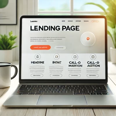
Have you ever landed on a page and immediately hit the back button? Yeah, me too. We’ve all been there. Blinking banners, confusing copy, way too many buttons — it’s like the internet equivalent of a pushy car salesman. But here’s the good news: creating a landing page that actually converts doesn’t require magic — just a few smart tricks (and maybe a little caffeine).
Let me get into the real-deal secrets to designing landing pages that don’t just look pretty, but turn curious visitors into paying customers.
Keep It Laser-Focused
A high-converting landing page has one job. Just one. Not five different offers. Not a bunch of distractions. Just one clear action for your visitor to take — whether that’s signing up, buying, or downloading something juicy. Think of your landing page like a first date. Keep it simple. Make it clear what you want them to do. No mixed signals!
Headline = Hook
If your headline doesn’t grab attention in 3 seconds, your visitor is gone. Bye. Make it bold, benefit-driven, and super clear. No jargon. No fluff. You’re not writing a college thesis — you’re solving a problem. Fast.
Example:
Bad: “Our Solution is Optimized for Lead Generation Efficiency.”
Better: “Get More Leads Without the Tech Headache.”
Do you see the difference?
Visuals Matter (Like, A Lot)
Use one clean, eye-catching image or video that supports your message. No stock-photo smiles, please. Realness connects. Show your product in action, or YOU — the human behind the biz. People buy from people, not mystery brands.
Benefits > Features
This one’s a biggie. People don’t care how fast your software loads. They care how it helps them sleep better at night, make money, or save time. Always write with your visitor in mind — what’s in it for them?
Tip: Try writing your copy as if you’re texting a friend. Keep it casual and clear.
Make the Button Pop
Your call-to-action (CTA) should be loud and proud. “Buy Now,” “Start Today,” or “Yes, I Want This!” — something action-oriented and enthusiastic. Oh, and use a contrasting color for the button. We want it to stand out, not blend in.
Want to Skip the Tech Stuff and Have Your Landing Page Done FOR You?
If you’re ready to start making money online but don’t want to deal with design, copy, or any of the complicated stuff… good news. There’s a 100% done-for-you business opportunity called MAP that gives you a high-converting landing page, sales system, and mentorship — all ready to roll.
👉 Click here to check out MAP and start your plug-and-play business today!
No guesswork. No stress. Just a clear path to your first (or next) online income.
